Drawing Kumoko every day for a hundred days

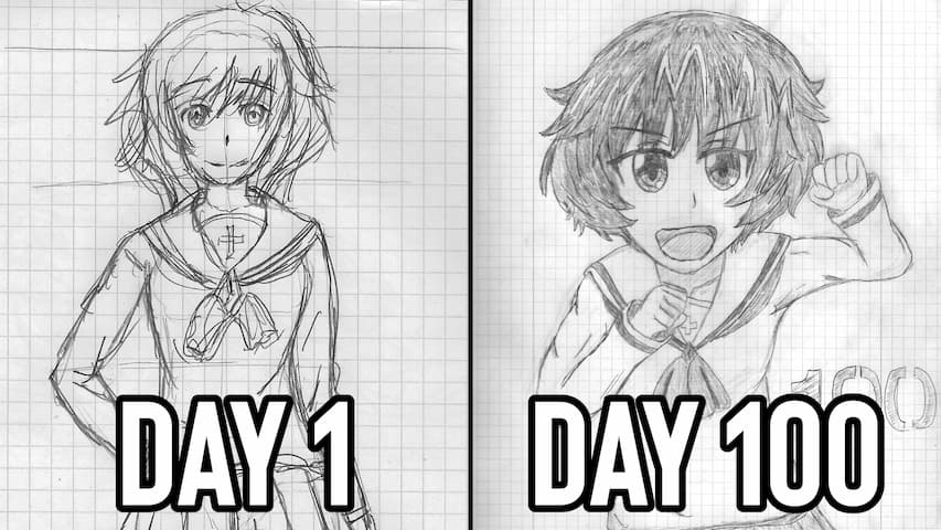
Ach ja, on the 14th of December 2022, I randomly decided to draw a picture of everyone’s favorite little spider Kumoko (Hi, I’m everyone). Despite me barely caring about it at the time, as you can see by me not even bothering to correct any of the obvious parts like the head, I thoroughly enjoyed it, as I probably haven’t drawn anything since some quick scribbles to illustrate a short story from over a year ago. So coming the next day, I came up with the idea of drawing Kumoko every day for some time. I have already heard something about the “Draw something for a 100 days”-challenge/concept and since practice makes perfect, I figured I could give it a try, though I didn’t thought I would actually fill all the hundred pages of my note book.
I suck at drawing. I actually tried to get into drawing several times, but I always tended to stop relatively quickly as, in the finest “Gifted child to utter idiot”-pipeline, when you are not good immediately at something new, you loose interest quickly, because you never learned to have to actually put honest effort into something. It also doesn’t help that I never actually learned any methodology on how to draw (or creating any art, really), meaning my best attempt always had to solely rely on reference, but without knowing anything about how to actually apply it. But everyone has to start somewhere, so, I simply grabbed a random pencil, got my sharpener out of my pencil case from school and rummaged through our small art supply box to find an eraser that was probably abandoned over a decade ago.
Anyway, here is my way too detailed rundown of what I learned from drawing Kumoko every day for a hundred days.
The design of Kumoko
Kumoko, in her base form, is actually rather easy to draw. She mainly consists of two shapes – a slightly elongated and squished sphere for the abdomen and another sphere for the head that is a bit wider at the bottom than the top. From there on, you add the two ears, the “collar” around her neck and four pairs of legs. The last steps consist mainly of drawing the face, which is basically two anime eyes, another six small circles, a mouth and you complete the drawing by adding the details and shading the differently colored spots. So far so good.
I mostly oriented myself by the designs for the anime series, as they are more simple to draw than the designs from the novels and I also prefer them visually. There are also the two manga versions, but I honestly don’t like the designs in them, mostly as Kumoko is always portrayed with a three-segmented body, which is… the point of spiders is them only having two segments, not three! Kumoko is a spider, not an ant! Anyway, choosing the anime design would also mean I basically have a pool of 24 episodes of references… or so I thought.
Here is the thing though: It is still not as trivial as it probably should be. Getting a full understanding of her entire design only via shots from the anime is a bit of a bother, as she is seldom shown full body or in a perspective where you can study her design, so I mostly relied on this one picture of her character profile, but what I would have actually liked to have would be a character sheet showing her from several angles, not just the front and some of her facial expressions to go with it. Surprisingly, I couldn’t find any Settei from the anime. Best-case scenario would be me having access to her actual 3D model, but as this would obviously not happen, I had to do with some of the fan-made models. Nai wa~.
Getting started and difficulties
Before I started drawing, I always created a little thumbnail version in the top left corner for what I would like to draw. There, I basically figured out how I want to pose Kumoko and from what angle I would draw her from. This is apparently an actual art tip, as it gives you a general idea of how the finished product will look like and it is very easy to adjust and change things. Maybe a bit overkill if you are simply drawing a character, but this helped me immensely getting a feel of how anything will/can look like.
The first hurdle was figuring out how big the two segments of her body are in relation to each other. The aforementioned visual portrays her abdomen as around two to three times the size of her head, which I thought of as a bit big and judging by from her Nendoroid version, which has a smaller ratio of around 1:1.5, I think it was a good call to draw it a bit smaller. For the length, I basically just eyeballed it for the abdomen to not look weirdly elongated or too squished. Another thing I had to (second)-guess was how the abdomen would connect/intersect with the head, as this region is conveniently obfuscated by her collar, but I eventually just figured I would draw the beginning of the abdomen somewhere to the middle of her head and make the collar protrude out from this point, covering the area where the two shapes would intersect.
I actually never bothered learning how even simple shapes behave under different rotation and perspective, making drawing the basic form for the head and abdomen always a bit difficult. Sure, I know how to extend a square to a cube, but beyond that, I simply kept drawing an elongated circle at an angle behind a normal circle, until I ended up with something that comes a bit closer to what it should look like and I could then further shape it up, until it looks like her body. Theoretically, I knew that you should simply be able to interpolate from the width to the length (or height) of the head and abdomen depending on the angle, but as long as I was not drawing her directly lined up with the imaginary camera, this was simply to much for me, so I varied the circles until I came up with something that I could expand from… to very varying effect.
The head was always a bit harder than the rest of her body, as it is only symmetrical from the front, meaning distorting the basic circle for the head became a lot more complicated at an angle. The head is at its widest around the cheeks and the lower half is elongated from the top, resulting in some interesting displacement once rotated. While it is still far more simple than a human head, it was still, especially at the beginning, mostly a process of trial and error until I came up with something that somehow looked right, despite me at least knowing in principle how the silhouette of a head changes when rotated.
Something that I only noticed relatively late was that the collar actually wraps along the abdomen and doesn’t stand upright like with the dilophosaurus from Jurassic Park. While subtle, this is technically a form of foreshortening, which I was heavily unprepared for and often couldn’t really draw at all. It is also a bit rounded, which made putting the individual “spikes” along the collar and how to actually connect them with each other a bit hard for when you can’t really wrap your mind around the geometry of the body. I especially had a lot of problems with the lower four spikes, as I always messed up the size and position. Again, I know it is essentially just a seven-point star, but given how it slightly wraps around a round surface, this task becomes a lot less trivial.
Another thing that made me questions myself are the legs. The legs themselves are relatively simple, being a cylinder and a cone connected via one joint, but how and where do you place them? In the anime, Kumoko’s legs aren’t consistent and the reason for this is that they are actually not connected to the body. You can see this when Kumoko is framed from below, like in this and this example. From a modelling and animation perspective, this is actually genius, as it allows to freely move the legs around the body and allowing for more poses or shots where they would otherwise be in the way. For learning and reference purposes though… yeah, where should her legs be?
In real life spider anatomy, all legs are connected to the side/bottom of the cephalothorax. However, Kumoko doesn’t really have a cephalothorax, just a head (cephalon) connected to the abdomen, making the available space to attach the legs to a lot smaller. This might also be the reason why the manga designs introduce a sternum-esque segment between head and abdomen, essentially creating a pseudo-cephalothorax. What I eventually went with is attaching them to the body depending on the perspective. When looked at from the front, I would draw the legs as if they would protrude from the imaginary sternum, but the area where they connect to the body would then be fortunately covered up by the head or collar. When viewed from the side, I initially tried to group them towards the head and simply put them them over the collar, but eventually spread them more along the bottom side of the abdomen later on. When standing or viewed from the underside, I positioned her legs a lot more closer to the middle and spread them out more with the hind legs often being placed around the middle and under the collar. The other legs are then often drawn over the collar.
Orienting the legs was also finnicky. With humans, the orientation of the legs is mostly directly correlated to the action, i.e. standing, running or sitting and the arms mostly follow suit, either just hanging idly, complementing the pose or having their separat action. Now, Kumoko has four more appendages, so what am I supposed to do with all of them? When either standing or stretched, I usually extended the hind legs opposite to the bodies orientation, imitating human legs. Similarly, I often used the front-most legs as arms and extended them forwards. The middle legs were often just placed idly perpendicular to the body, if they are not either acting as either legs or arms respectively. Oftentimes, like when simply standing or laying, I simply drew the legs straight behind each other, basically copying the exact form and shifting them slightly to indicate depth. This is also the reason why a lot of the drawings feel a bit stiff, as there is no dynamism or any indication of movement with the legs mostly standing still. I never looked up an 8-legged walk cycle, as I assumed the leg placement would be quite complicated, but is is actually rather simple: The front legs move in opposite directions of each other, the second pair of legs counteracts the front pair and the third and fourth pair mimic the first and second pair respectively. The more you know!
Coming to the face, this was somehow simultaneously the easiest, but also the most frustrating part. I kinda know how to draw faces. The head shape is another matter, but like every 15-year old watching anime, I drew my fair share of eyes and with the anime style, there isn’t a lot in terms of noses and mouths. In fact, no nose required at all, though I later tried to indicate the “snout” a bit. Kumoko’s eye design is also rather simple, though as always, I struggled a bit with the details on the eye lashes, as I normally draw them quite simple. Placing and sizing the eyes did pose a bit of a challenge, especially with my heads being a bit deformed. Drawing the eyes also got a bit more easy when I actually decided on an expression, as the exaggeration of the eyes covers up slight imperfections. This became very noticeable, when my “neutral” eyes turned out kind of weird, especially so when the rest of the drawing was also not up to par. The other eyes are jus small circles with very easy placement once the main eyes are drawn. I actually slightly deviate from the official art in drawing the lower row of eyes on the forehead a bit closer to each other and creating a sort of V shape instead of a square with the upper row. It’s subtle, but I actually prefer it this way.
Concerning the mouth, you might call me a bit lazy on that. I drew the mouth flatly on the surface of the head without taking into consideration how the opened jaw would actually change the shape of the head. I also drew the mouth a bit higher, as it should be normally located directly at the lower end of the face with the fangs extending beyond the silhouette of the head. However, Kumoko’s mouth is, again, rather simple and basically consists of the two fangs at the edge of the mouth with two lines (or one when closed) indicating shape and how opened the mouth is. The inside of the mouth is also easy with a slight arch at the bottom indicating the tongue and a darker area behind it.
Lastly, the ears(?). Despite having some thickness to them, they can be drawn flat without much issue and I just kinda got a feel for it where to start them and how big they are supposed to be. I accidentally started drawing the triangle cut-out at the top of them quite big and sharp, but eventually noticed and flattened it. I never got around to not always orient them towards the imaginary camera though, as I couldn’t figure how to get the perspective right on my own.
The rest mostly comes down to smaller details like the circles on the abdomen or the coloring. The circles on her back consist of five rows of three slightly elongated circles of around the same size, but I tended to draw the middle on a bit larger. Placing them along the abdomen should be relatively easy, but I somehow never came up with the idea to draw orientation lines, so most of my circles are perspectively straight up wrong. On the color side of things, Kumoko consists of only three colors – White, a dark grey and pink – which nicely map to the grey tones of a pencil drawing by adjusting the strength. The coloring was surprisingly therapeutic and I had a lot of fun at the beginning simply filling the outlines, but I later put less time into it, as I spend a relatively large amount of time on something that doesn’t matter all that much and it would also result in less pressure marks from the pencil on the page below.
Ideas and Poses
You know how, when asked to speak in another language, you can’t, for the life of it, think of something to say, despite having the whole word arsenal of another vocabulary on your side? This was me, constantly, with trying to figure out how to draw Kumoko. It is not like I had a prompt list prepared beforehand so I had to come up with something new everyday, though saying to “to come up with something” and then only referring to a pose does sound a bit silly. In fact, a good chunk of my drawings are just Kumoko in her idle pose from different angles, really. Also, basically all drawing are shown from slightly above and or from a 3/4 view. You can basically see, whether I gave up or not, when I drew Kumoko from the front.
What greatly helped me was imagining Kumoko actually doing some kind of activity that goes beyond just standing still. I wasn’t really good with any kind of indication of movement, but either reacting to something or posing her along another object did wonders in terms of breaking up her posing. What came next was imagining a theme or a small story arc that I could continue for a few pages. For example, I drew Kumoko as she found and tries to crack the egg from the beginning of the story, or drew her in a circus setting. There are also a couple references thrown in for good measure, like copying the poses of the first five JoJo protagonists, some memes or references to specific dates like Christmas or New Year’s Eve. I also drew Kumoko in some of her humanoid forms, like in her idol costume. Something I unfortunately forgot, was drawing her along some of the spider Pokémon, as I imagined it being a bit funny and wholesome. I also took in some general ideas of Kumoko’s journey and wanted her to progress over the span of the drawings.
Something I noticed in retrospect was that I sometimes drew her rather sad or isolated and to be fair, I wish I had done so even more frequently. Despite being a hyperactive menace to anyone around her, there is something rather melancholic and lonely to Kumoko’s existence. Being thrown into an unknown situation by an evil god and unable to to form any positive connection, as she would be killed by anything that she didn’t kill first, there is an inherent loneliness and sadness of her being on her own, which I thought was an interesting aspect to portray. So yeah, the idea of Kumoko piling stones on top of another alone, kind of sticked with me and thus, her face became sad. The same can be said about the other drawings with more low-key vibes and calmness. Kumoko going off-trail and trying to reach an apple on a tree might just be my favorite idea of all the drawings.
Backgrounds, Monsters and Props
Initially, I hadn’t even thought about including backgrounds, mostly because they take additional time that was already running pretty low with me in the beginning taking over an hour to just draw something resembling Kumoko. I did, however, liked the idea of including props, mostly as they are easier to draw and would help contextualize what I drew Kumoko for, or rather allow Kumoko to do something other than simply standing.
The same can be said about some of the monster I tried to draw. I was not confident enough to actually portray a fight, so I mostly drew the confrontation and hoped for the best that I wouldn’t fudge the design. The monster designs in So I’m a Spider are, with the exception of the larger monsters and dragons, surprisingly easy in contrast to other series. Still way above my skill level, but they should be at least recognizable.
Around the half-way point, I became a bit more interested in trying out drawing additional background elements. To be honest, you could probably rummage through some of my drawings from kindergarten and barely spot a difference, but it was fun and I continued trying. My biggest hurdle was figuring out how to draw the inside of a cave and with what elements to populate the area. I basically started out with indicating differently leveled planes posing as the floor and putting rocks everywhere. The anime was also a big help with how these backgrounds should look like visually, though I kind of gave up on drawing the walls of the caves, as I couldn’t figure out the texture, nor did I have the slightest clue on how to draw the lava for the middle stratum. Once Kumoko left the labyrinth, the backgrounds got significantly easier, as I could now draw stuff I was at least familiar with… if I would actually touch grass, that is.
If there is one thing I learned from drawing the backgrounds, it is that you can just simply search for tutorials on YouTube for how to draw all the stuff. Don’t know how to draw clouds? Look it up! Trees and stones? Look it up! Basics of perspective, level of detail and composition? Guess what, there are several video on that! You can probably pinpoint the exact moment I started watching tutorials that actually teach me how to draw the things I only attempted until then. Took me way too long to finally do this step, but better late than never.
Evolutions and different Forms
Over the 100 days, I drew Kumoko 62 times as a Small Lesser Taratect, 25 times as Zoa Ele, nine times as Zana Horowa and finally four times in her Arachne form. I skipped Small Taratect and Small Poison Taratect, as they basically look identical beyond a slightly changed color scheme and some additional details. Same can be said about the Ede Saine form, as it is the same as Zoa Ele, but the head and collar have merged together.
Now let me rant about how much I hated drawing Kumoko as a Zoa Ele. While the abdomen as a Small Lesser Taratect was a relatively simple elongated sphere, the Zoa Ele abdomen is… a lot. It is basically made up from five overlapping plates that wrap around up to the bottom of the abdomen in a sort of irregular and curved hexagon. Also spikes… lot’s of spikes. I still don’t know how many and where to actually put them, as the problems with finding references were exaggerated with the Zoa Ele form. It just now came to my mind that there is a rotating shot of Kumoko in the beginning of the opening that changes depending on her evolution, but even there it is still hard to make out everything else. Most importantly though, it is stupidly hard to draw, as I never could figure out how much of the abdomen is supposed to be visible or what shape it should have.
Next up are the legs again, which are fortunately just a tiny bit more complicated. The number of segments and joints goes up by one and the individual segments are now visually divided and made up of individual parts. This changed the posing of the legs, as the first segment is now supposed to go slightly up from under the body, then down with the second segment and the last one touches the ground. The front legs now have a scythe as their last segment, which made go insane figuring out how the scythe is shaped and how this shape then works in a 3D space. Like with a lot of things, I eventually gave up trying and drew them from the same angle every time.
The rest isn’t really that interesting. The ears have another shape and volume now, but aren’t that hard to draw once you understand how to indicate depth, the collar became smaller and, depending on the angle, can almost be ignored or just hinted towards and the face stays basically the same.
Being at the Zoa Ele stage, I could finally draw her other personalities… I mean, it is not like I was forbidden beforehand, but I thought it more appropriate to start drawing them at the corresponding stage. With the body brain, it is basically just adding the headband and ~eyebrows~. The two magic brains are another matter, as they have a bit more clothing to them. The capes actually came in quit handy, as they cover up a good portion of the abdomen, but they are also blocking a bit of the legs and have to wrap around the neck, which made non-euclidean space very appetizing… which is code for “please don’t pay too much attention at the cape for magic brain #1”. I kind of handled it well for magic brain #2, but I also didn’t went as interesting with her cape. Additionally, I had to draw a hat and a hoodie respectively. Drawing the magic hat was fun, but I have a feeling it sits always a bit too high, as if it is too small for the head. The hoodie was interesting, as it was great for learning volumes, but I also drew it probably two numbers to small, so it looks like magic brain #1 and information brain pulled a prank on her and and wrapped the head in cloth.
Going from Zoa Ele to Zana Horowa felt almost liberating, as I didn’t have to think about this stupidly complex abdomen again and could return to a more regular shaped one, though getting the design right took me a few days again. My biggest difficulty was getting the head right, as it has these spikes extending from the head, which are hard to draw at an angle. The collar also became more extensive an irregular, causing me for one drawing to just handwave it, draw some squiggly lines and call it a day. The abdomen, despite all the spikes and little marks, is relatively easy, similarly to the Small Lesser Taratect, just with a lot more details. The red marks aren’t that difficult to draw on the body, especially if you ignore their depth like me. The spikes also didn’t cause a problem, as I had enough practice drawing spikes from the Zoa Ele. However, as mentioned, it took me a few days to realize that there are a total of seven spikes, creating some inconsistencies. If there is one thing that caused me trouble, its the end of the ears, where I couldn’t get the fluffy(?) bit right and just randomly drew four half-circles.
Lastly, there is the Arachne form. I initially thought about drawing an incredibly detailed spider body and always finish it off with a literal stick figure, but turns out neither am I good enough at drawing, nor would it actually be funny. With the Arachne, I actually didn’t bother that much with references and mostly oriented myself on the most notable features, like the legs, head and its collar, placement of the human body, this little shield behind the human body and the general shape of the abdomen with the spikes. It essentially resulted in a spider body that is a lot larger to the ratio of the human body and it has a stronger separation between the head and the rest.
Also, after drawing spiders for over three months, when it came to the human body, at first, I was like “Oh right, the human body. The human body for the Arachne. The Arachne chosen specially for the human body. The Arachne’s human body… that human body?”. Yeah, any knowledge of human anatomy absolutely left my brain, when it became time to draw one. I also severely underestimated how much space I would need for the human body to draw it, as it is quit a bit more dense on detail and my line-art wasn’t necessarily the cleanest when drawing the Arachne. Also, arms… I hate them. I had only some problems with the head and face, despite them turning out rather wonky and the rest of the body also kind of works, or isn’t at least as bad as I initially feared. Even the chest looks decent, though I also am not brave enough to draw it any bigger in the first place. If there is one thing I really want to improve on, it’s the legs… they look so baaad :D.
I deeply respect the poor animators that had two draw her by hand in the last episode.
Conclusion
I mean, considering I started drawing Kumoko on a whim, I am still astonished I actually pulled through with this self-imposed challenge. There wasn’t really a point to it all (To be fair, nothing I do does), but I am still glad I did it. I don’t think I will pick up drawing in the near future, though maybe there will be a “Drawing Akiyama Yukari every day for a hundred days” if I really feel like it, but I can confidently say that I can improve on my art skills and, despite public opinion (Hi, I’m public opinion), am not a lost cause. After all, the number one art tip is simply practicing a lot, though I would personally put “Let other artist explain basic stuff” on a very close second. And even if there is no helping me, I still gained another interest in the art of backgrounds, which I spend the last week binging tutorials over tutorials on. Thanks for reading my four and a half pictures worth of words on drawing Kumoko.
If you are interested in all one hundred Kumokos, they are available on my Google Drive.
Related Posts
Comments


















Recent Posts
5357 Words | April 5, 2026
2583 Words | February 8, 2026
2716 Words | December 28, 2025
3211 Words | December 12, 2025
1515 Words | October 30, 2025
