The Making of this Blog
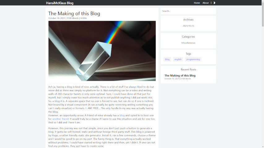
Ach ja, having a blog is kind of nice, actually. There is a lot of stuff I’ve always liked to do but never did as there was simply no platform for it. Not everything can be a video and writing walls of 280 character tweets is only semi-optimal. Sure, I could have done all that just for myself, but I simply crave too much attention as to not publish anything I did put work into. So, a blog it is. A separate space that no one is forced to see, but can do so if one is inclined. Not bound by a visual component (It can actually be quite restricting writing something you can’t really visualize) or formats. I. AM. FREE… The only hurdle in my way was actually having the blog.
However, an opportunity arose: A friend of mine already has a blog and opted in to host one for another friend. It would truly be a shame if I were to use this situation and ask for one too. And so I did and I here I am.
However, this journey was not that simple, since you don’t just push a button to generate a blog. It gotta be self-hosted, static and without foreign third-party stuff. This blog is powered by Hugo, a rather friendly static site generator. Install it, run a few commands, choose a theme and I would be good to go on my part. The funny thing is, that everything actually worked without problems. I could have started writing right there and then, yet I didn’t. If one can not find any problems, they just have to create some.
The theme I chose is Blonde. It looks good, has all the features I would like to have on a blog and I really wanted a theme with thumbnails. And even if something is bothering me, I can still change it… and changed it I did. A keen eye might spot that this theme is only “based” on Blonde (I think this distinction is justified at this point). I am about to say some mean things, so I want to make it clear that I think wamo did a fantastic job on this theme. Looking at the default site, I wouldn’t say anything bad about it… I mean, I decided on it, however there were few minor things that just… bothered me, so I went to change it and found myself in a small world of pain. Always remember: Programmers deserve nothing, but the wall.
It started good. The theme comes with a config file, including things like: Title, description, how many posts can be displayed on a single page, setting light/dark theme as default, disabling thumbnails and a few other basics. The first problem I ran into was changing the the base color used for the header and footer. Since 2016, I use a circle gradient background going from white to a desaturated teal, specifically #90b6b6. Since I use this shade of teal for several things, I thought it would be a good idea to use this very same color for the blog and if I didn’t like it, there are still 16.777.215 different colors to choose from. So I went to the base_color attribute, only to be greeted by bg-gray-800… What is that?.. where is my HEX code?
Introducing Tailwind CSS. With the exception of the actual content, i.e. this posts, nothing on this site uses normal CSS. All the styling is made using Tailwind CSS directly in the HTML structures. I never heard of Tailwind CSS before, but after using it on this blog… yeah, I like it a lot. Syntax is sligtly different than normal CSS, but nothing Google can’t help. Overall, pretty good… except how it handles colors.
Tailwind CSS doesn’t simply let you select a color. It instead uses a color palette that limits you to the colors in that very palette. By default, there isn’t even a palette included, though Tailwind CSS has some predefined palettes which one can import. Those however are limited to nine different shades of a hue in the form of hue-X00. Looking into the file where the palette is defined and not even every hue was included. These palettes can be extended however and as so wants, there was already code for it with the extension of warmgray. Great! Changed the HEX code of shade 700 from #2f3335 to #90b6b6 and set base_color to bg-warmgray-700 and… its a warm gray. What? How? Why is it gray?
As it turns out, I can change its HEX code to anything or even delete it and it stays the same. Okay, Plan B. Simply add a new shade to the warmgray. So I added the shade 750 (As per the documentations instruction) with the HEX code #90b6b6, set base_color to bg-warmgray-750 and… at leasts it’s not gray anymore… it’s transparent. What? How? Why is it transparent? It is a valid value, right?
A quick sanity check later and as it turns out that no matter which HEX code I use, the header and footer become transparent. Sure, Plan C it is. Just add an entirely new color to the palette. Simple enough and after a few more lines… it is still transparent. How difficult can it be to change a color? I already spend way more time on it than anyone would believe me and it is still not done. I eventually gave up and settled, ironically, on bg-warmgray-700. It goes well with the (mostly) grayscale design and most of Tailwind CSS predefined colors look horrible as they are too saturated.
I honestly do not understand why one would to something as basic as color so complicated…
On to the next issue. Leaving changes to the actual design for later, I looked at the structure to the theme and as it later turned out, I did two stupid things. First loading the whole theme as a submodule resulting in some confusions as I later tried to push it on my repository and secondly, loading the entire repository, resulting in some useless files like images used for the README and exampleSite. The submodule problem was later fixed and the unnecessary files were simply deleted… what I didn’t know is that, despite not actually being part of the theme, the example site turned out to be the most helpful resource.
The folder archetype contains a markdown file used as a template when creating new posts. It usually contains a head with attributes like author, title, date and so on. The markdown file in this theme was empty… Why is it empty? Why is it empty in general, but also how do I add the thumbnails? This theme has no documentation… Fortunately, the example posts contained a head. No post had every attribute, but I could gather them all after going through most of them. The example posts were also not consistent, using both the toml and yaml format, resulting in me being confused as to why the site crashes if the head uses both formats. Remember exampleSite? It has the (almost) complete archetype, including automatically generating the correct archive based on the date… Why is it not in the actual theme? Not that it matters, as it also misses the attribute for the thumbnail… what a mess.
If at no other point, this must have been the first time I thought that the creator of this theme was a designer first and a programmer… maybe fourth?
Cleaning up the whole project, I finally got to the design part that couldn’t be customized via the config file.
Let me make this clear: There is a lot going on! Some are simple differences in how this site should look, but there are also some design decisions so utterly weird that I am not sure if they were due to questionable intend, negligence or a result of unmaintainable code.
Some of it is just me tweaking or changing parameters or adding stuff: Make the header and footer smaller, let the header stick to the top, place the copyright on the same height as the “Powered by Hugo”, but aligned right, let the post move left instead of up when hovering over it and I suppose changing the date format from YEAR/MONTH/DAY to something actually readible like MONTH-NAME DAY, YEAR all count to that.
Some changes needed more work like how the actual posts are structured: I removed the “Navigation” for jumping to the next/previous post, as I found them silly and deleted the area used for Disquis as I don’t intend on using it. I moved the tags under the content and added the categories too. Originally, the tags were followed by a “|”, opting as a separator, but I preferred the [tag] formatting, as just adding any character after the tag leads to an unnecessary separator after the last tag. I added a code snipped to calculate the reading time and placed it next to the release date. I also moved the thumbnail image under the title instead of the beginning of the post. I initially removed the image entirely, but added it again at a later date as I thought it looks good at its current position. It unfortunately can’t be scaled down though.
Again, nothing necessarily wrong with the theme here, those are just my preferences.
Less forgiving are most of the paddings in the individual elements:
- The horizontal line separating title from content and tags/archives had inconsistent padding. I also made them have the same padding at the top and bottom
- The top and bottom padding for “Categories” is bigger than the one for “Archives” and “Tags”. It also has no left and right padding for some reason
- “Recent” has a bigger top and bottom padding and no left and right padding too
- “Tags” has no right padding, misaligning the text slightly off-center
- Left and right padding for the tags is smaller than for archives and categories
- I gave “Archives”, “Categories” and “Tags” the same left and right padding as bottom padding
Those are just the paddings in single element. The real deal were the paddings and margins between each of the elements. Here I recommend cross-checking the default site for comparison.
The bottom margin of the post is slightly bigger than those of the widgets, so depending on whether the post is shorter or longer than the widgets, the margin to the footer differs.
If you click on one of the categories or tags, you will see that the first post will align nicely with “Archives”. If one goes to the main page however, it is neither aligned with the search or “Archives”. The reason is that the space between the header and the first post is occupied by an area used to display the text of the archive/category/tag name. This area is empty (as in non-existent) on the main page and the first post appears slightly lower as the search bar due to its top padding. I understand the reason to leave this area blank… but why not just deal with the space by adjust the margin on the posts? Especially if you can simply fill this space with an empty character like (ㅤ), resulting in everything aligning, even without any text… Then again, the posts on your main page is ordered by date, so why not call it something like “Newest” or “Main Page”? This little gap is so weird! Why would one keep it?
There may be more of those little padding and margin inconsistencies, but those are the ones I remember.
Now we go for the just straight up unforgivable stuff. Most of it isn’t even visible, but it made my life so much worse.
Most of the paddings or margins are done every way possible: Want padding on all sites? Just use p-5… or as was often done with py-5 and px-5 resulting in the very same output. Same goes for top/bottom (and left/right). Sometimes just px-5 is used, sometime both pl-5 and pr-5, which led to to some trial and error until the padding was actually applied right.
Next is the code for the dark mode and by extensions the light mode. Most of the elements change their color when changing between those two modes… as is the very purpose of this function. If you want to adjust those color however, you only have to go to every single occurrence of the color, as every single color is hardcoded to its element. If I were to change the background color, or font color, etc. I would have to go to every single element and change the color in its class descriptor for both the light and dark theme. While it is possible to do so, as there are not “that many” elements (I counted 10), it definitely would not be if one were to scale this theme up. It is especially weird however, as there is a very simple solution to this problem… one already implemented elsewhere!
For the background color of both the header and footer, this theme uses a variable that is defined in the config file. The solution is to do the same, but not just with the “base color”, but with every single color used by the elements! The config file is exactly the place where all this should be defined! It also erases the possibility of accidentally using a wrong color for consistent elements. This might actually be a thing I won’t just change for me, but actually create a pull request on the original repository, as it seems like an absolute no-brainer to me.
It’s CSS time! Or so I thought… editing the existing CSS file didn’t do anything. Took me some time to figure out, that the normal CSS file blonde.css isn’t even referenced in the head.html, but instead its minimized version blonde.min.css. Editing a minimized file is not really user friendly, as all the code is squashed into a single long line. Not that it mattered as even editing the blonde.min.css changed nothing. Some additional Google searches later and I found out, that one can add a custom.css that would overwrite the existing CSS. Creating the custom.css file, adding an additional line to the config and copying the head.html from the theme into the layout/partials of the root directory and most of the work is done. Only thing left to do is referencing the new custom.css, for which the tutorial site was generous enough to provide the code, and the blog crashes… I sighed. Removing the code, I notice a line in the head.html already referencing a custom.css… great. Without doing anything else, I changed the custom.css and it works… there is just one question: Why do you reference a file that does not exist?
Ok, this one is forgivable, actually. The blame lies partially on me and on the tutorial I used, as it ultimately didn’t work. I am glad the framework for the custom.css was there and it makes sense to not have an empty file lying around, but instead create it when deemed necessary. I could probably revert the steps from the tutorial and just create the custom.css in the same directory as the blonde.css and blonde.min.css, but copying the head.html and placing the custom.css into the root has the nice side effect of overwriting it. Also, it works as it is right know. I don’t have the energy to deal with it, if it does something I don’t want it to :D
I eventually commented the reference to blonde.min.css and copied everything from blonde.css into custom.css. The reason I commented the reference to the original is that, while changing an attribute works fine, deleting one in custom.css still leaves the attribute in blonde.min.css. Again, logically, the best course of action would be to just reference blonde.css, instead of blonde.min.css, and change that, however this didn’t work earlier, but my current set-up does. It is a problem for another day.
The only thing left to do was finally changing the CSS. The default CSS has some weird settings like making the padding for a paragraph only half a line (specifically padding top and bottom a quarter of a line each). I immediately changed it to a full line, so you can actually see the paragraphs now. I also made the ridiculously huge top margin of the H2 heading way smaller. Also, the line color left of the H2 heading was not consistent with the rest of the site. The rest are just minimal changes.
That leaves us… or left me, to be precise, with just one small thing: The icons.
The given icons are not bad per se, but I wanted to change them anyway, especially the “Sun”. So, where do the icons come from? I asked myself. Good question! was the answer I received. Normally, you would import them in your header from sources like Google Fonts or Font Awesome and simply include them wherever you want. This theme did something different. After some digging, I found a folder named “fonts” containing a ttf, woff and svg file. Don’t know what a woff file is, the ttf was a simple font, but the svg file confused me. Opening it with Inkscape or GIMP and it looks empty. Opening it with VS Code and in there are 13 icons defined. Great, 13 predefined icons and I am not sure how to even add an icon or change an existing one. I mostly understand how they are integrated into the site itself, but time will tell. I definitely didn’t understand the icon toggle for the light/dark theme.
And that should wrap it up. Again, no hate against wamo. He did more than just a fantastic groundwork and I would never have been able to come this far alone. There is just something about working on other peoples code that brings out the worst myself. Some design decisions aside, great work ^^
So, what can I look forward to?
First, continue to refactor the code. Adding color variables to the config and organizing the CSS locations would be a good start. Second, changing the way icons are handled. I really want to change them. Third, though already partially done, adding a word count and reading time to the posts. Fourth, implementing a better search, as the current one just uses Google… and at last, being able to add custom colors, so I can change the header and footer :D
Quick Edit: Why are the “Recent Posts” shuffled? I mean, sure why not, but why not call it something like “Random Posts” instead… yeah, fixed that one.
This turned out way longer than I anticipated. Have a great day ^^
Related Posts
Comments


Recent Posts
5188 Words | July 4, 2026
2386 Words | June 8, 2026
2082 Words | May 13, 2026
5357 Words | April 5, 2026
2583 Words | February 8, 2026